Home Page
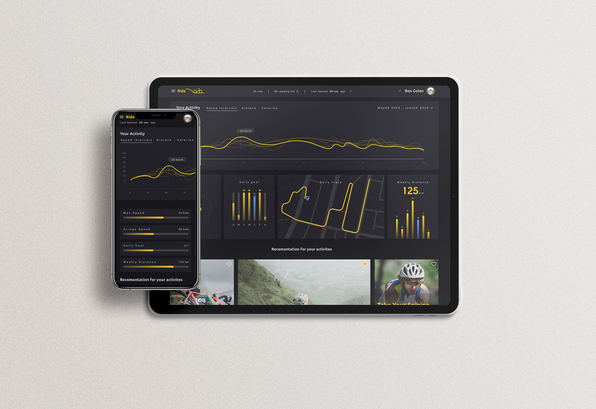
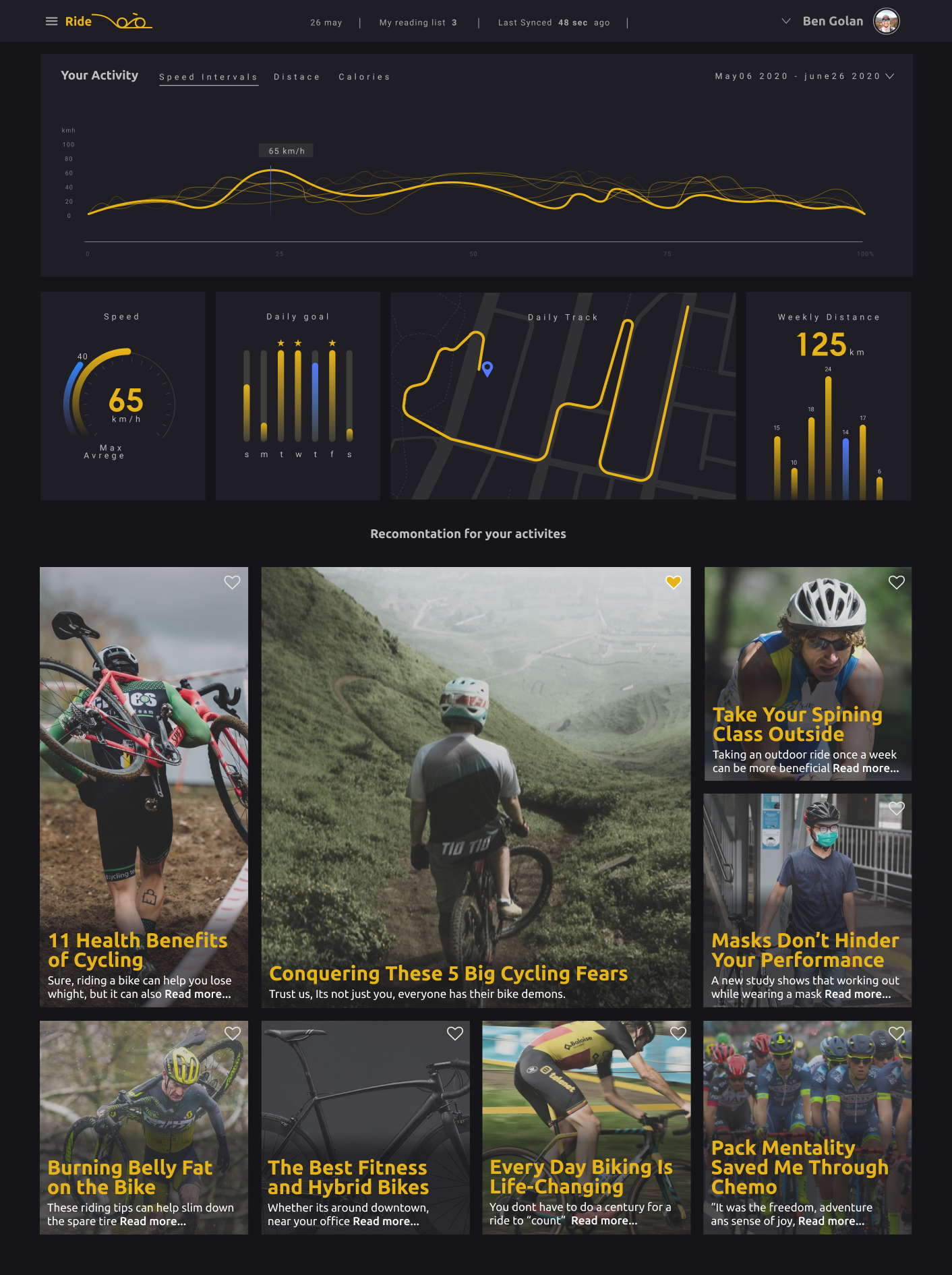
UX by 'Create.' The site displays a dashboard with data on the rider's cycling history and articles about riding. I chose vibrant and energetic colors to match the vibrance of sports and give the app an energetic feel.
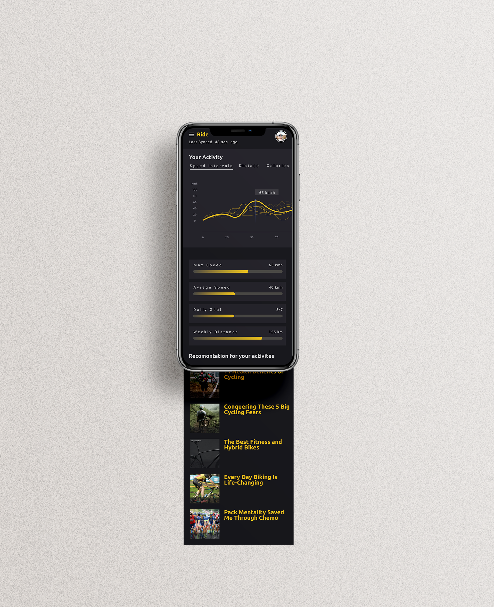
Mobile
Dashboard Element
Speed intervals - Looking at the graph, the user can get a visual representation of his riding speed throughout the track. By using tonal layers, where each layer represents a different riding day, the user can see his/her performance throughout the week.